
Design System for SaaS
JDA (now Blue Yonder) is a global leader in supply chain, retail, and manufacturing software, serving over 3,000 enterprise customers. Following a series of major acquisitions, the company’s product ecosystem had become highly fragmented, with deep visual, UX, and brand inconsistencies across more than 100 applications.
I was brought in at this critical point to help unify and modernise the visual experience across the organisation. The mandate was twofold: create a new design system for JDA’s next-generation SaaS platform (Luminate), while also aligning and uplifting legacy enterprise applications to a consistent visual and usability standard.
The goal was not just to introduce a new system for future products, but to establish a scalable visual foundation that could operate across both modern SaaS platforms and long-standing enterprise software used side-by-side by customers. This required balancing consistency with flexibility, modernization with stability, and standardisation with adoption.
I joined as the sole Visual Design Practice Lead, owning the creation of the new system and the evolution of the legacy systems in parallel. Working with a distributed team of UX designers and hundreds of developers, I focused on building a scalable, accessible, and future-proof visual platform that could unify the organisation without disrupting existing products or customer workflows.
Unified 100+ fragmented applications
Foundation for Luminate SaaS platform
Design system still reflected in Blue Yonder products today
Design at scale · Systems leadership · Enterprise transformation · Cross-org alignment
My Role
I joined JDA as the sole Visual Design Practice Lead, at a time when 100+ applications suffered from deep visual and usability inconsistencies.
Led the creation of a new design system for Luminate SaaS and Digital Edge Solutions, covering both desktop and mobile, while evolving legacy systems to align with the new visual direction without disrupting underlying architecture.
Collaborated with a distributed team of UX designers across the US, India, and Canada, supporting design consistency across both SaaS and legacy products, and indirectly impacting over 500 developers.
Defined all visual elements (excluding the Luminate logo) and introduced a soft-branding model, allowing individual applications to express subtle identity while remaining part of a unified ecosystem.
Team & Collaboration
- Design: ~10–12 UX designers (distributed team)
- Engineering: Developers across SaaS platforms and legacy systems
- Stakeholders: Product and leadership teams across multiple business units
- Cross-functional: Collaboration with marketing on soft-branding initiatives
Challenge and Goals
The scale of JDA's product portfolio post-acquisitions presented immediate and complex challenges:
- Pervasive Inconsistency: Over 100 applications, each with its own legacy, resulted in significant UX, visual, and branding inconsistencies.
- Dual Design System Mandate: While the primary focus was on the new Luminate SaaS solutions, there was also a critical need to uplift legacy applications to match the evolving brand aesthetic, leading to the development and maintenance of two distinct design systems concurrently. This meant supporting both initiatives as the sole visual designer.
- Accessibility Deficiencies: The existing design system for older applications was not compliant with WCAG standards for text or colors, posing a significant accessibility gap.
- Resource Scarcity: Operating as a single visual designer supporting a vast organization (with 500+ developers and 12 UX designers) demanded highly efficient processes and strategic leverage of existing frameworks.
Our overarching goals were clear:
- Unify the User Experience: Establish visual consistency and a cohesive brand presence across all JDA applications, new and old.
- Drive Scalable Design: Create a robust design system that could be easily adopted, maintained, and evolve with future product development.
- Enhance Accessibility: Ensure all new and updated visual elements met WCAG accessibility standards.
- Empower Teams: Provide clear guidelines and accessible tools for designers and developers, fostering collaboration and reducing design debt.
- Introduce Strategic Flexibility: Implement a "soft-branding" approach to allow for application-specific identities within the overarching JDA brand, a critical aspect for customer adoption and internal brand alignment.
Discovery and Research
I began by auditing the existing design system and legacy applications with the UX team, prioritising patterns that were frequently used across products.
Together we:
- Analysed shared wireframes to identify common components
- Catalogued UI patterns used across the organisation
- Defined a visual system that complemented existing UX flows
I created a formal contribution and review process for the new SaaS design system. This working model was approved by the UX Director, PMs, and VP of Engineering & Product, ensuring executive alignment and long-term adoption.


Design Approach
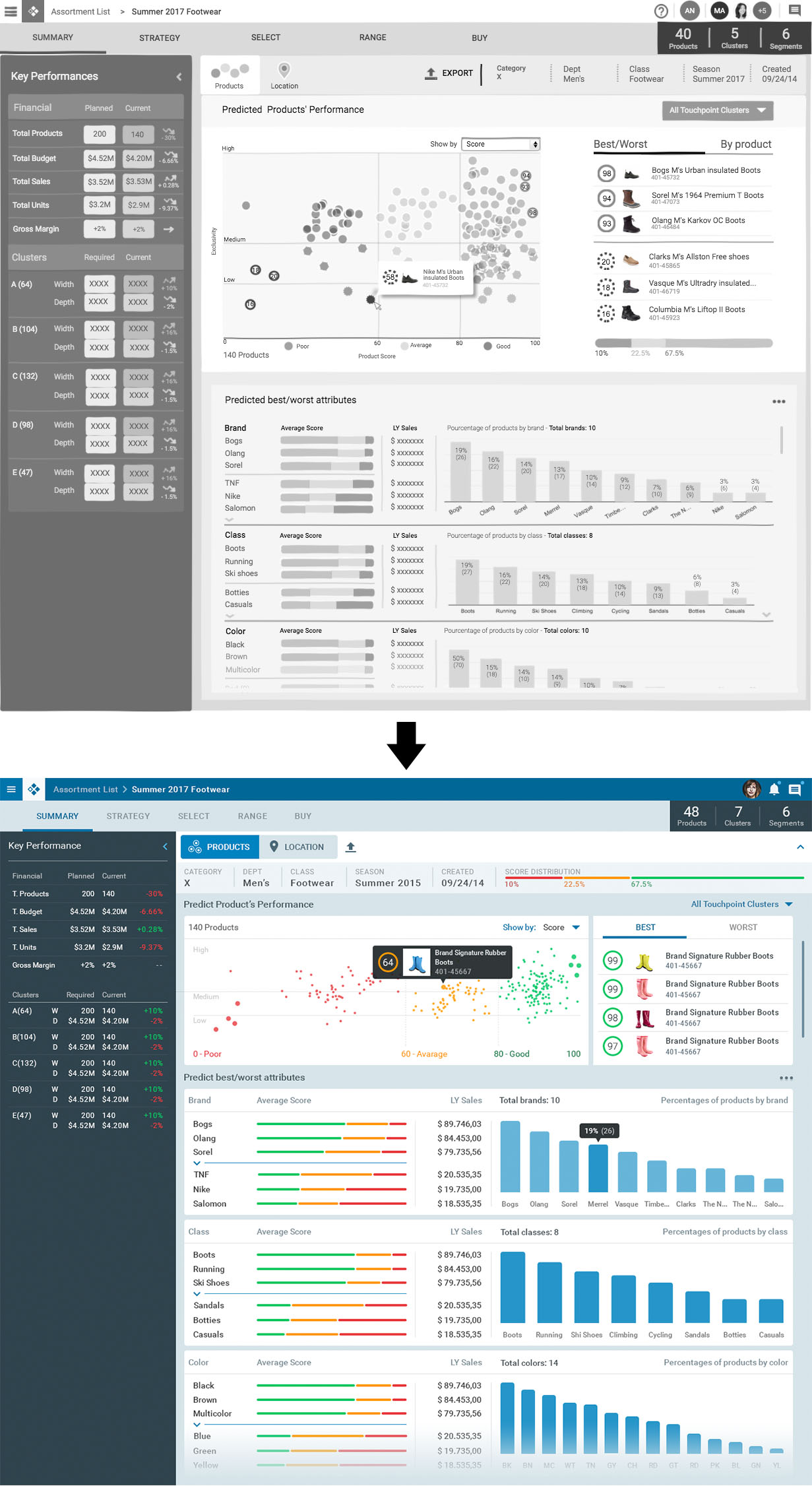
With limited resources, I used Google Material Design as a technical foundation while crafting a custom JDA visual identity on top.
In parallel I evolved the legacy system by introducing:
- Updated colour palettes
- New typography system
- Refined components with WCAG compliance
Each legacy application was evaluated and modernised thoughtfully, as many customers used both old and new systems side-by-side.
I also led the creation of an internal design system website, transforming documentation from static PDFs into a living, developer-friendly hub. This platform became widely adopted and significantly improved internal alignment and implementation consistency.
Translating UX into UI
I regularly translated complex UX wireframes into polished, production-ready visual designs.
In many cases, I refined layouts to resolve:
- Visual clutter
- Hierarchy conflicts
- Inconsistent spacing
- Accessibility concerns
I ensured all interactive elements met usability standards for both mouse and touch environments, balancing density with clarity.

Interaction and Visual Design
This was my first opportunity to lead visual direction at this scale — and I owned it fully.
Key contributions:
- Color Palettes: Developed a comprehensive, brand-aligned, and WCAG-compliant color system.
- Typography: Defined consistent scale and hierarchy for readability and rhythm.
- Iconography: Created a cohesive, scalable, and intuitive icon set.
- Component Styling: Adapted Material Design components into JDA’s unique visual language, detailing states and spacing for buttons, inputs, cards, and tables.
- Layout & Grid Systems: Established principles for balance and responsiveness across screen sizes.
These visual specifications enabled 500+ developers to implement consistent UI across dozens of applications.


Special Focus
The Soft Branding Initiative
A major challenge was that customers often removed JDA branding from their software, weakening brand presence.
I introduced a soft-branding system inspired by Adobe and Microsoft Office models. Each application was assigned a unique colour identity linked to its functional domain, while still remaining clearly part of the JDA ecosystem.
I collaborated with Marketing, Product, and Branding to gain alignment and build trust. The result was enthusiastically received both internally and by customers, solving a long-standing tension between customisation and brand recognition.


Outcome and Impact
The Luminate Design System became the foundation for how JDA — and now Blue Yonder — designs its applications.
Internal Impact:
- Accelerated and standardised development
- Improved cross-functional collaboration
- Clear visual foundations across SaaS & legacy systems
- Increased leadership confidence and sustained investment
External Impact:
- Stronger brand perception in the enterprise market
- More cohesive, modern user experience
- Greater customer trust and usability
- Scalable model still reflected in Blue Yonder products today


Key Learnings
This project solidified my ability to lead design at extreme scale and complexity.
Key lessons:
- Early stakeholder alignment unlocks adoption
- Systems thinking multiplies impact
- Frameworks can accelerate without limiting creativity
- Communication is as important as design
- Trust across silos enables innovation
Most importantly, I learned how to lead transformation without a formal title; only through clarity, consistency, and execution.
"Filip had the knowledge and expertise to create a strategic road map that would carry our brand seamlessly into our UI and UX experience. His deep knowledge of the digital space, strategic problem solving, and rock-solid design skills were a huge asset to JDA."
Ross West - Global Creative Director @ Blue Yonder Software

