
Microsoft's Fluent 2 Website
Fluent 2 is Microsoft’s modern design system. When I joined the project, its documentation existed only in partial legacy files, with fragmented guidance, no consistent structure, and no clear platform experience for designers and developers. The system itself was still evolving, and there was no central product that could function as a single source of truth for adoption across the organization.
The goal was not simply to “launch a website,” but to create a scalable platform that could serve as the primary entry point for Fluent 2. It needed to support multiple audiences (designers and developers), multiple platforms (Web, iOS, Android), and long-term system growth, while maintaining clarity, accessibility, and usability. As the ecosystem evolved, the platform also needed to accommodate emerging AI patterns and Copilot experiences, ensuring the design system could support new interaction models and future product directions.
I co-led the project as Principal Designer, owning the end-to-end UX, information architecture, interaction design, and visual direction. Working with a lean core team across time zones, I focused on building a product-grade experience that could evolve with the system rather than a static documentation site.
Primary Fluent 2 reference across Microsoft organization.
250,000+ users in first month
Product thinking · Platform design · Design at scale · Cross-team collaboration
My Role
I served as Principal Designer and UX lead for the Fluent 2 platform, shaping the website as a scalable product and adoption platform rather than a static documentation site.
I partnered closely with a content designer, PM, and front-end engineering, while collaborating with Fluent design, accessibility, and illustration teams, as well as external development partners across time zones.
I owned the system-level experience, including information architecture, platform UX, interaction strategy, and visual direction. My focus extended beyond feature delivery to long-term scalability, accessibility, and organisational adoption.
This included leading key platform capabilities such as dark and high-contrast modes, platform switching, component navigation, authentication flows, and embedded feedback systems, while helping define how Fluent 2 evolves and scales across Microsoft.
Team & Collaboration
- Core team: 1 designer (myself) + 1 content designer + 1 front-end engineer + 1 PM
- Extended team: Fluent design, accessibility, and illustration teams consulted as needed
- Support: Additional engineering contractor during specific development phases
- Cross-functional: Collaboration with Microsoft product and platform teams contributing to Fluent adoption
Challenge and Goals
When I joined, the Fluent 2 website existed only partially in legacy files. Documentation was fragmented, the system was still evolving, and there was no clear structure or no clear visual direction.
The primary goals were to:
- Establish a clear, navigable structure for designers and developers
- Showcase Fluent 2 using its own tokens and components
- Ensure accessibility, performance, and scalability
- Support multiple platforms in one unified experience
- Support multiple platforms in one unified experience
Discovery and Research
I began by auditing the Fluent 1 site and interviewing the Fluent Design Director to understand the system’s long-term ambition. With support from the core team, I led surveys and 1:1 interviews with designers, engineers, and PMs to identify needs and friction points.
Key insights revealed two distinct priorities: developers wanted structured access to code and examples, while designers needed visual guidance and Figma resources. To support continuous feedback post-launch, I designed a persistent, in-page feedback tool, enabling users to submit context-specific input without interrupting their flow.
These insights directly shaped the site’s structure, navigation, and content hierarchy.


Design Approach
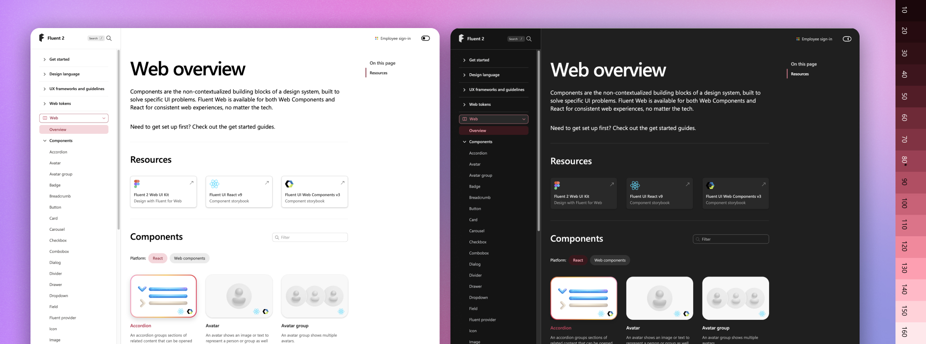
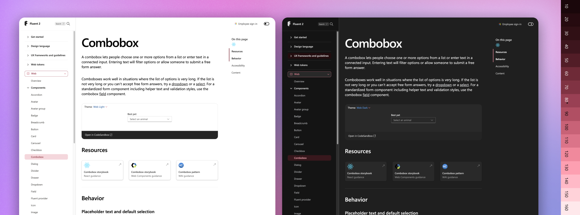
I treated the website as a product, not a static documentation hub. I restructured the information architecture around user goals rather than internal categories, defining scalable templates with consistent hierarchy and navigation patterns.
I introduced a platform switcher for Web, iOS, and Android views and established reusable layout rules and modular components in collaboration with engineering to support long-term growth and maintainability.
Despite limited resources, I coordinated cross-time-zone development efforts, maintaining a tight design-to-implementation feedback loop to ensure quality, accessibility, and consistency through launch.
I also partnered with Engineering and Design leadership to define Fluent 2 adoption scorecards, creating shared visibility into how new work was aligning with Fluent 2 and how legacy products were transitioning over time. This transformed the platform from a launch artifact into an operational system, enabling leadership to track progress, identify adoption gaps, and prioritise transition efforts across Copilot and M365 web apps.
Strategic Platform Decision
I advocated to keep Storybook separate from the website to avoid duplication, inconsistency, and long-term maintenance risk under limited resourcing. This allowed the Fluent 2 platform to focus on guidance, structure, navigation, and adoption, while preserving a reliable workflow for code ownership and updates.


Interaction and Visual Design
I led the interaction and visual system design to ensure the platform balanced clarity, usability, and long-term maintainability. This included defining responsive layouts, interaction models, navigation behaviors, and accessibility standards that could scale across teams and content growth.
Motion and micro-interactions were used selectively to support comprehension and orientation without introducing visual noise. While most of the UI leveraged Fluent tokens and components, custom elements such as the platform switcher and feedback system were designed to align seamlessly with the Fluent visual language.
I also led the creation of the dark theme and high-contrast modes, ensuring both aesthetic quality and accessibility compliance.


Special Focus
Information Architecture: Structuring for Clarity and Scale
Information architecture was a core platform challenge. I defined a scalable content taxonomy and navigation model that unified design, code, and guidance into a coherent system.
This included:
- Global navigation for high-level wayfinding
- Local navigation for contextual orientation
- Embedded component structures for clarity
- Deep-linking through anchors and headers for precision access
This structure was designed to serve multiple audiences simultaneously — enabling designers to access detailed guidance and Figma resources, while allowing developers to move efficiently between documentation, implementation, and tooling.
The system was intentionally designed to scale without fragmentation, ensuring long-term maintainability for content creators, engineering teams, and platform governance.
Through stakeholder feedback and evaluation, I led the consolidation of fragmented guidance structures into a unified model, with deep technical documentation remaining in Storybook. This reduced maintenance complexity, improved clarity, and helped shift internal perception of Fluent 2 from an abstract initiative into a practical, trusted platform.


Outcome and Impact
The Fluent 2 website launched at Microsoft Build 2023 as the official home of the design system. Within the first month, it attracted 250,000+ users and became the primary reference point for Fluent adoption across Microsoft and its partners. Its structure and navigation patterns have since influenced other documentation initiatives across the organisation.
Fluent 2 was designed not just as a system, but as a transition platform, enabling measurable adoption across products with deep legacy complexity.
Impact:
- Operationalised Fluent 2 adoption through cross-team scorecards tracking new adoption vs legacy baselines
- Enabled leadership visibility into transition progress across Copilot and M365 web apps
- ~200k monthly active users, with returning usage increasing as content continued to ship
- Most-used platform feature: dark mode and high-contrast support
- Recognised internally as the primary source of truth for Fluent guidance, alignment, and contribution
"His systems-thinking mindset helps scale design excellence."
Kurtis Beavers - Partner Design System Director @ Microsoft
"We handed Filip a complex project that had stalled for years. He delivered."
Dr. Alice Ferng - Director of Innovation & Technology @ Microsoft
"Filip pushed the Fluent site forward with vision, clarity, and care."
Ian Guisard - Fluent 2 Senior Designer @ Microsoft


Key Learnings
This project reinforced the importance of structure, clarity, and scalability when designing for large, diverse audiences. Strong information architecture proved just as critical as visual and interaction design.
I strengthened my ability to balance vision with practicality, align cross-functional stakeholders, and advocate for user needs through both data and intuition.
Most importantly, I saw how a well-designed system can build trust, enable collaboration, and shift organisational mindset.
Fluent 2 became not just a product, but a shared platform for contribution, alignment, and innovation.

